3. User Interface
When working on a specific dataset, the User is confronted usually with something like the following image.
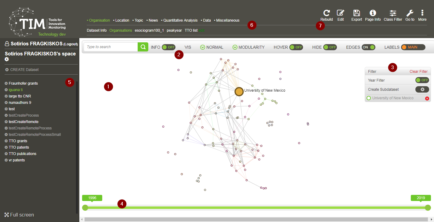
The elements marked in the image above, are presented in the upcoming sections.
3.1. Main view
There are various visualisations available, from simple text and html to network graphs, tables and combinations of tables and plots, organised into categories and viewable as pages, and here is where they are displayed.
The most often-used visualisation is the network graph.
3.1.1. Network graphs
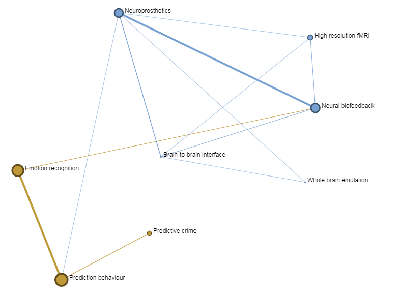
TIM uses network visualisations extensively to display data. These network visualisations consist of nodes and edges.
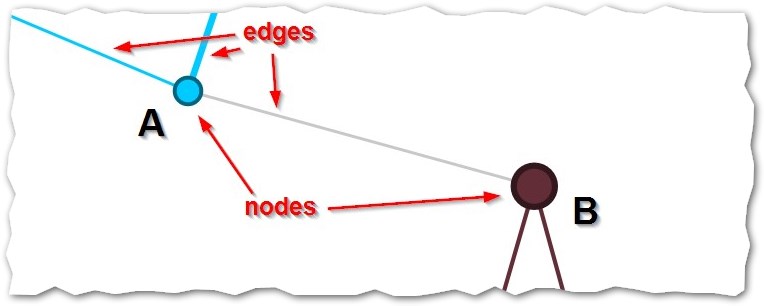
What a node represents depends on the visualisation that is selected.
For example, when viewing the page Location>cities, each node represents a city; when viewing Topic>Author keywords, each node represents a publication/patent keyword provided by its authors.
The size of each node corresponds to the number of documents associated with that node. Thus, node A in the figure above corresponds to less documents than node B. If this graph displayed cities, say city A and city B, it would mean that there are more documents associated to city B than documents associated to city A, showing a bigger presence of that city for that particular set of documents.
Note
Documents are not contained exclusively in one or the other node. It might very well be that e.g. a scientific paper was written by two authors from two institutions, one based in city A and one based in city B. In that case, that document would be counted twice, once for node A and once for node B.
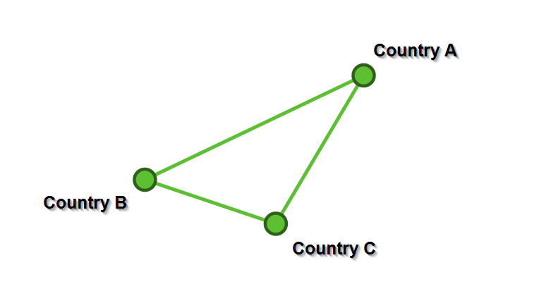
The edges generally correspond to documents that the two nodes have in common. For example, if a document has three institutions from three different countries, then there will be an edge among all those three countries, showing that these three countries have a document in common. Keep in mind for later that what the edge signifies (here: documents in common) can be customized.
The thickness of each edge represents the number of documents in common.
For the three institutions from three different countries example, the edge between each node would be of size 1.
3.1.1.1. Datasetgram
In the main view, when no specific dataset is selected, the graph shows all the datasets of the space (listed in the navigation panel), each one being represented as a node. The visualisation principle of TIM applies here: the size of the node represents the number of documents retrieved for that dataset while the edges represent documents in common between two datasets. From this graph then, you can see, for example, a) how big each of your datasets is and b) how they relate to each other.
3.1.1.2. Node Positioning
Although there is a significance in the positioning of the nodes, it might not be what one would expect. The layout algorithms used by TIM are force-directed, meaning that they position the nodes by assigning forces between the nodes: - spring-like attraction forces when the nodes are linked with an edge, - electrical repulsion forces when the nodes are not linked, as if the nodes were electrically-charged like-signed bodies. In general, the bigger the edge, the greated the attraction; the bigger the node, the greater the repulsion. The aim of the algorithms is to make the graphs readable more than anything, there is no absolute meaning in the position of the nodes, other than what stated above. More connected nodes would tend to be placed more towards the centre, but this is a geometrical property of the graph, it makes sense for drawing purposes; they are not placed centrally because they are necessarily more important. In a graph where there are no connections at all, there would still be nodes placed in the centre, and that would be more or less random.
Note
There are other forces at play behind the scenes, depending on the specific algorithm being applied, but this should be enough to get an idea of what one is looking at.
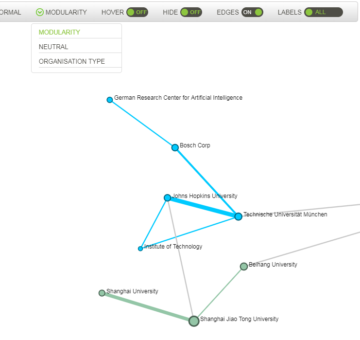
3.1.1.3. Node colours
The nodes can be coloured to show different qualities of the network. The default behaviour is to colour them by their communities, i.e. nodes of the same colour belong to the same community. Community –or clique– in this context means entities (organisations, countries, keywords, etc) that are associated together more than they are associated with other entities. The quality and relevance of the communities (which is actually a type of clustering), is measured by their modularity. In the case of organisations, linked nodes of the same colour would have more co-publications/co-patents etc with each other than with the other organisations they are linked with in the graph. But it could also be that they are brought together in the same clique because they are strongly tied to a common node.
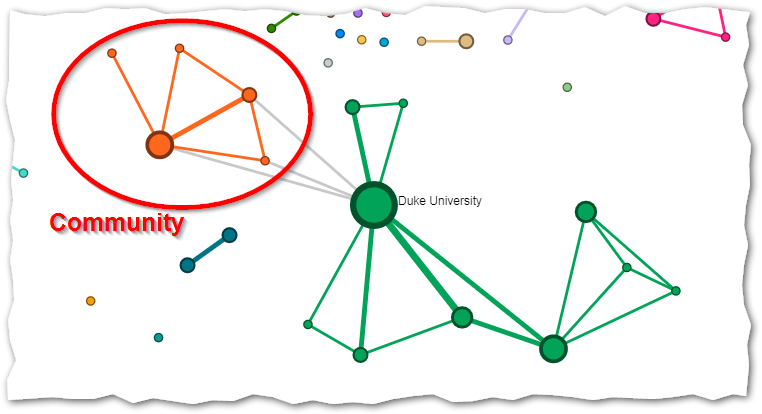
The specific algorithm used in TIM, called Louvain Modularity, is a commonly accepted clustering method of nodes in network graphs and only relies on characteristics of the network, without taking into account any semantic measures of similarity.
It can be applied to any network and it does not have to be applied necessarily to documents.
Unfortunately, there are some known limitations to this algorithm, but there are plans to include other clustering options in the future, for complementarity.
The important thing to keep in mind is that a threshold modularity value is pre-set for the user, which automatically decides the optimal number of communities to show for the given graph.
This means that the number of communities is not a number “set in stone”, it does not have any inherent meaning; rather, it is given as an approximation, as a way to group nodes at a glance.
Note
Often there will be edges between nodes from different communities, and they will be coloured in gray. These should not be dismissed as unimportant, they are only marked as not belonging to the same community, which, again, is not an inherent characteristic of the network.
For more information on the Louvain Modularity algorithm please see the relevant scientific article and the Wikipedia page.
For more information on the algorithm implementation used, please have a look at Gephi.
3.2. Tools panel
The tools panel allows the user to modify the appearance of the network graph displayed in the main view.

3.2.1. Search
Search allows searching for a node in the graph. After three or more characters are typed, it suggests the labels of the nodes that coincide with the search. Click on the relevant label and the visualisation will automatically zoom in to the relevant node. If no items are listed after typing at least three characters, it means that the search wasn’t able to retrieve any results.
3.2.2. Info on/off
When the info switch is ON, a panel appears on the left side of the main view with the list in alphabetical order of all the nodes of the currently displayed graph.
The list is clickable and the view will zoom to the selected node.
3.2.3. Vis
This button adjusts the visual complexity of the graph by hiding nodes or edges according to their specific size. Both edge and node size selectors will show in brackets the minimum and maximum sizes of edges or nodes that are currently displayed. These values can be modified by dragging the selector bars. It is possible to adjust both the minimum and the maximum size of edges and nodes. The same can be done to adjust the size of the edges displayed.
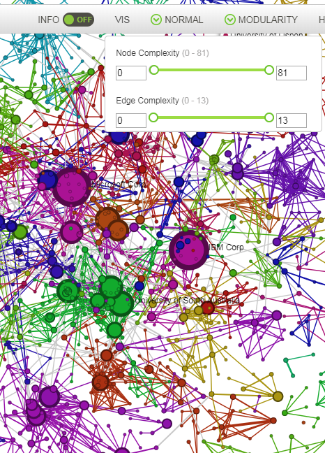
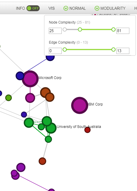
Example of Node size selection: Visualisation of the same graph with all the nodes (left) or with the nodes that represent more than 25 documents (right).
3.2.4. Order: Normal , Order by size / year / nr of connections
This drop-down menu allows the User to choose between a default (normal) visualisation of the graph or to order the nodes by size, by year or number of connections.
by size: the top left node is the biggest node and the down right one is the smallest.
by year: the node that appeared most recently is at the upper-left part of the grid, while the one that appeared first on the bottom-right.
by number of connections: the most well-connected node is at the upper-left part of the grid, while the most poorly-connected on the bottom-right.
The meaning of colours and edges remains unchanged.
3.2.5. Colours: Modularity
This drop-down menu allows the User to choose what the colour of the node/edge should represent.
3.2.5.1. Modularity
Modularity is the default option: each community is coloured with a different colour.
This option is available for all pages.
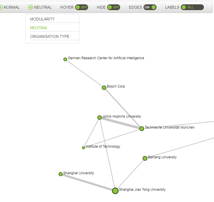
3.2.5.2. Neutral
This option disables the colouring of the edges and gives the same colour to all nodes.
This option is available for all pages.
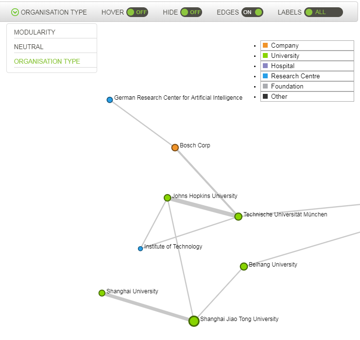
3.2.5.3. Organisation Type
This option colours entity nodes according to the entity type: Company, Foundation, Hospital, Research Centre, University.
This option is available for pages where nodes represent entities.
Note
The type of each organisation is not originally available in most of TIM’s data sources, so the colouring here is based on information extracted from the affiliation full name. If there is no extractable information in the affiliation name, (e.g. “CNRS” does not give any hints as to its type), then TIM will assume it is a company. This behaviour is, however, customisable for more advanced users, as are the type of organisations.
3.2.6. Hover On/Off
When hover is set to ON, hovering over a node makes only nodes and edges of the same colour visible.
When the colouring is set to Modularity, this will highlight all the nodes belonging to the same community.
When it is set to e.g. Organisation type, it will highlight all the entity nodes of the same type (Company, Institution etc).
3.2.7. Hide On/Off
Position by default is off. When a filter is active and hide is off, the non-selected items (outfiltered) appear shaded in a very light colour, so that some nodes can still be included in the filter.
When Hide is on, the non-selected items are hidden and therefore do not appear in the visualisation at all.
3.2.8. Edges On/Off
The position by default is on and the edges are visible. When turned off, the edges disappear from the graph.
3.2.9. Labels Main/None/All
By default, only the labels of the biggest node in the graph are visible, in order to optimise the visualisation of the data.
This is signified by the default setting Main.
You can cycle through three settings, Main, None and All.
There is an option in More>View Options in the upper right-hand side of the screen called Label threshold that allows you to control how many nodes will be labeled, when Main is selected.
The range is from 1 to 16, with 1 labeling all nodes and 16 labeling none of the nodes.
Please note that after enabling the settings, you will have to cycle once through the Labels, None>All>Main for the setting to be put into effect.
3.3. Filter panel
The filter panel appears at the right top corner of the main view only when it is active.
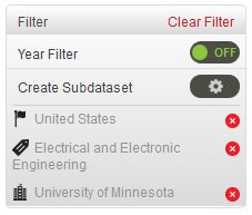
To activate a filter, simply double click on the node you want to filter for.
A filter allows you to work with only a subset of the dataset. Once applied, the filter will hide all the data items that do not meet the criteria of the filter. The filters can be defined with one or multiple criteria. The lower part of the panel indicates the items that are part of the filter.
The example above shows an active filter for documents from [United States + University of Minnesota + Electrical and Electronic engineering].
The filter panel allows the user to manage the (multiple) filter(s) that are applied to the visualisation of the dataset.
Every criteria of a filter can be de-activated by pressing the red x button.
To clear all filters, press ``Clear filter`` on the top right of the panel.
The filters work cross-graphs, meaning that a filter that is activated in one of the graphs stays active when changing graph. For example if we filter for a subject, such as Medicine and then we move to a graph that shows geographic information, we will see only the location(s) of the documents related to the subject Medicine.
The panel can be moved (drag by left-click and keep left button pressed).
3.3.1. Year filter
The year filter is used in conjunction with the year selector. Its use is discussed in the paragraph about the year selector.
3.3.2. Create subdataset
This functionality creates a new dataset based on the current dataset and on the filter applied. The newly created “Filtered” dataset will appear in the navigation panel just under the dataset it was created from. Its name is Filtered by default but it can be modified.
3.4. Year selector
The year selector allows you to see the relevant data only for a specific time frame. Move the year selector from the right and/or from the left to delimit a specific time window. The graph is recomputed showing only the data items that belong to the time period.
When the command “Year Filter” is on and the year selector is also activated, the graph will be filtered for the new items in that time period.
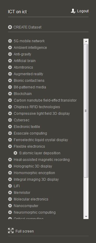
3.5. Navigation Panel
The navigation panel is used to navigate between the different datasets that have been created. In TIM Edge, for each of the subfields previously described, there is a list of datasets or technologies that can be browsed and explored.
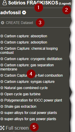
User/ Space information
Login / Logout
Create Dataset
List of datasets in this Space (in alphabetical order)
Full screen command
3.6. Page Selector
The page selector allows the user to select different visualisations for a specific dataset. The pages are organised in categories.
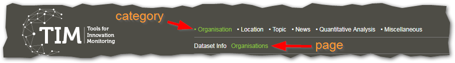
To see the description of the categories and all pages available in TIM see Pages.
3.7. Options
3.7.1. Main options
The options available can vary depending of the type of user.
3.7.1.1. Rebuild

To recalculate the graph or chart in case of problems.
This operation forces the “recalculation” of the graph and might take some time. Please first try if refreshing the page of the browser doesn’t solve the issue.
3.7.1.2. Spaces

This page allows to user to see the spaces he manages and other spaces (accounts) that have been made public.
For more information on spaces, see here.
3.7.1.3. Settings

Allows to modify several settings of the software:
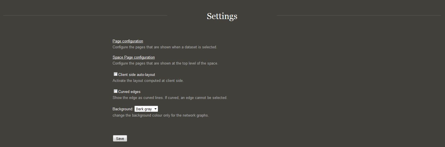
When a dataset is selected, some additional options appear in relation with the dataset.
3.7.1.4. Export
Most of the data in TIM can be exported. Use this option to exports
the data in several formats. The exports is always contextual to the
information projected in the graph 
3.7.1.4.1. Standard Excel
In the standard excel, the nodes of the graph will be in the left column of the excel and the corresponding number of items for each year will be on the right.
For example, if you export from the organisations page, the table will represent the number of documents per year for each organisation.
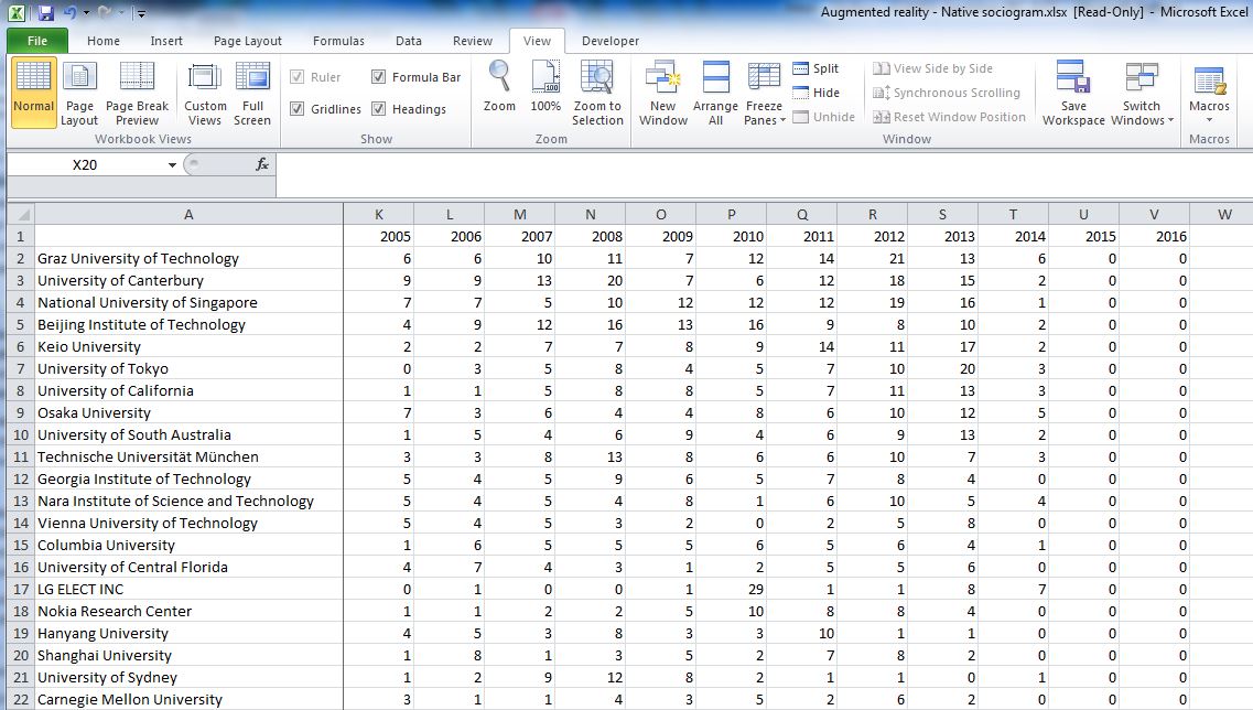
3.7.1.4.2. Compare Excel
This exports a matrix of the network graph, where both rows and columns are the nodes of the network graph. If nodes are representing organisations as in the image below, then the values in the diagonal show the documents where there is a single author/owner (e.g. cell B2), while the other values (e.g. cell B3) show the number of documents where the organisation of the column header and the organisation on the first cell of the row are co-authors or co-owners.

3.7.1.4.3. Gexf
This exports the network graph in format .gexf to be opened with the software Gephi. Complex operations on the network graph can be performed using Gephi.
3.7.1.4.4. Sorted Edges Excel
The sorted edges creates an excel file with the number of data items corresponding to each edge or pair of items.
3.7.1.4.5. Filtered exports
When a filter is applied, not all the exports show the filtered information. In case you need to export some filtered data, look for the mention “(filtered)” after the name of the type of export.
3.7.1.5. Page info

Page info contains information the displayed page, such as what it is showing, when it was created, how many documents didn’t fit the criteria and were thus skipped, whether it is filterable and last, what field are the nodes representing.
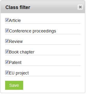
3.7.1.6. Class Filter

Class filter allows you to select which types of documents you want
to take into account for your analysis.
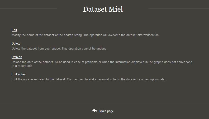
3.7.2. Dataset options
In the navigation panel, a small gear symbol allows you to access some options relating to the dataset.