7. Page Categories
Contents
7.1. Organisation category
Organisations are the institutions or companies that are affiliations of the authors of scientific publications, applicants of patents or beneficiaries of EU Framework programme grants.
Warning
Affiliation name information is currently not available for documents coming from the Semantic Scholar database, so a generic query on organisations will not yield any results from this database; it will only yield results for patents and EU grants.
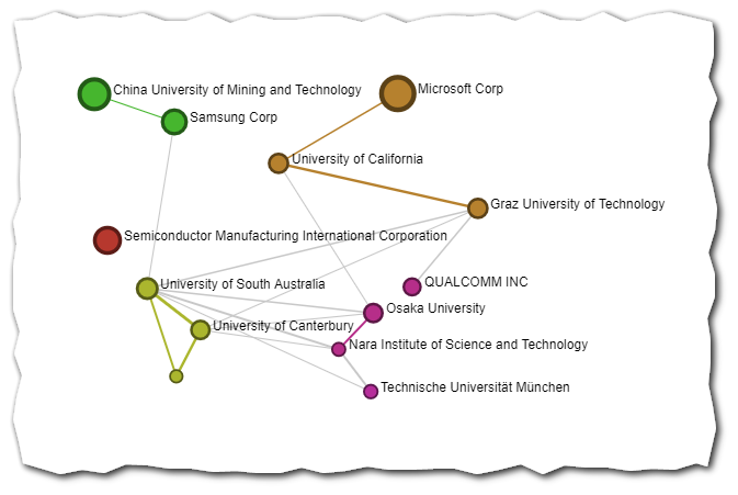
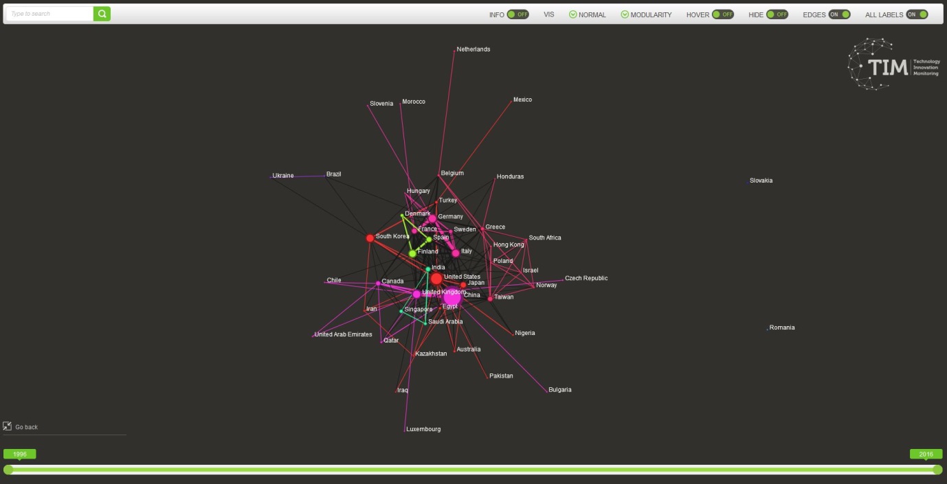
The graphs in this category are also called sociograms, i.e. graphs that represent the “social network” of the organisations. In a sociogram each node represents an organisation. The links between organisations represent a collaboration between two organisations. They correspond to documents where the two organisations appear. Therefore the links represent co-publishing, co-patenting or co-granting of EU projects.
The thicker the node, the more intense the collaboration (in terms of common number of documents) is.
For groups of organisations of the same colour, the graph suggests that those tend to collaborate more among themselves than with the others. (Read more about communities of nodes in the specific section).
This type of graphs allows studying the collaboration patterns between organisations that are active in publishing, patenting or beneficiaries of EU projects.
Because the names of the organisations come from different sources in a multitude of forms, a process of cleaning and harmonization is necessary. The tool used for processing and cleaning of organisation names is in continuous development and is not a 100% accurate: not all organisations are recognised and some errors may occur when attributing a unique identifier to variants of an organisation.
In TIM, the process of harmonising names of organisations is called entity matching. The Entity Matcher groups all the organisations and their different spellings with a predefined list of organisations. One of the main limitations of this approach is that if an organisation is not recognised then the node is not shown in the graph.
This document describes the pages that are available to basic users. More options might be available for advanced users.
If you don’t see the page you are looking for, go to Settings>Page Configuration>Choose a category and make sure the box is ticked for the page of interest.
To learn more about the processing of affiliations, read Affiliation processing.
7.2. Topic category
The topic tab in TIM gives access to all the graphs relating to the topics or themes of the underlying documents.
The “topics” refer to attributes in relation to the content of the documents.
Each graph gives the user a different perspective on the topics of the documents that are analysed.
7.2.2. Patent Classification
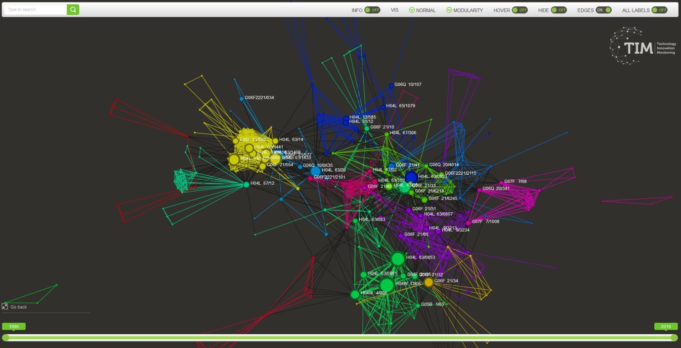
The patent classification graph is a visualisation of the CPC class attributed to the documents. Patent publications are each assigned at least one classification term indicating the subject to which the invention relates. For the nomenclature of patent classes see the European Patent Office page.
In a classificationgram each node represents a CPC class (for example: C12N 15/10 or F16K 47/18).
The link between two CPC classes represents that at least one patent has been classified in those two classes.
The thicker the node, the higher the number of patents that belong to that couple of classes.
This visualisation is based on the CPC class of the patents. All other types of documents are excluded from the visualisation.
7.2.3. Keywords
The keywordgrams are a visualisation of the keywords attributed to the documents. The keywords can come directly from the documents or be calculated by TIM using some text processing algorithms.
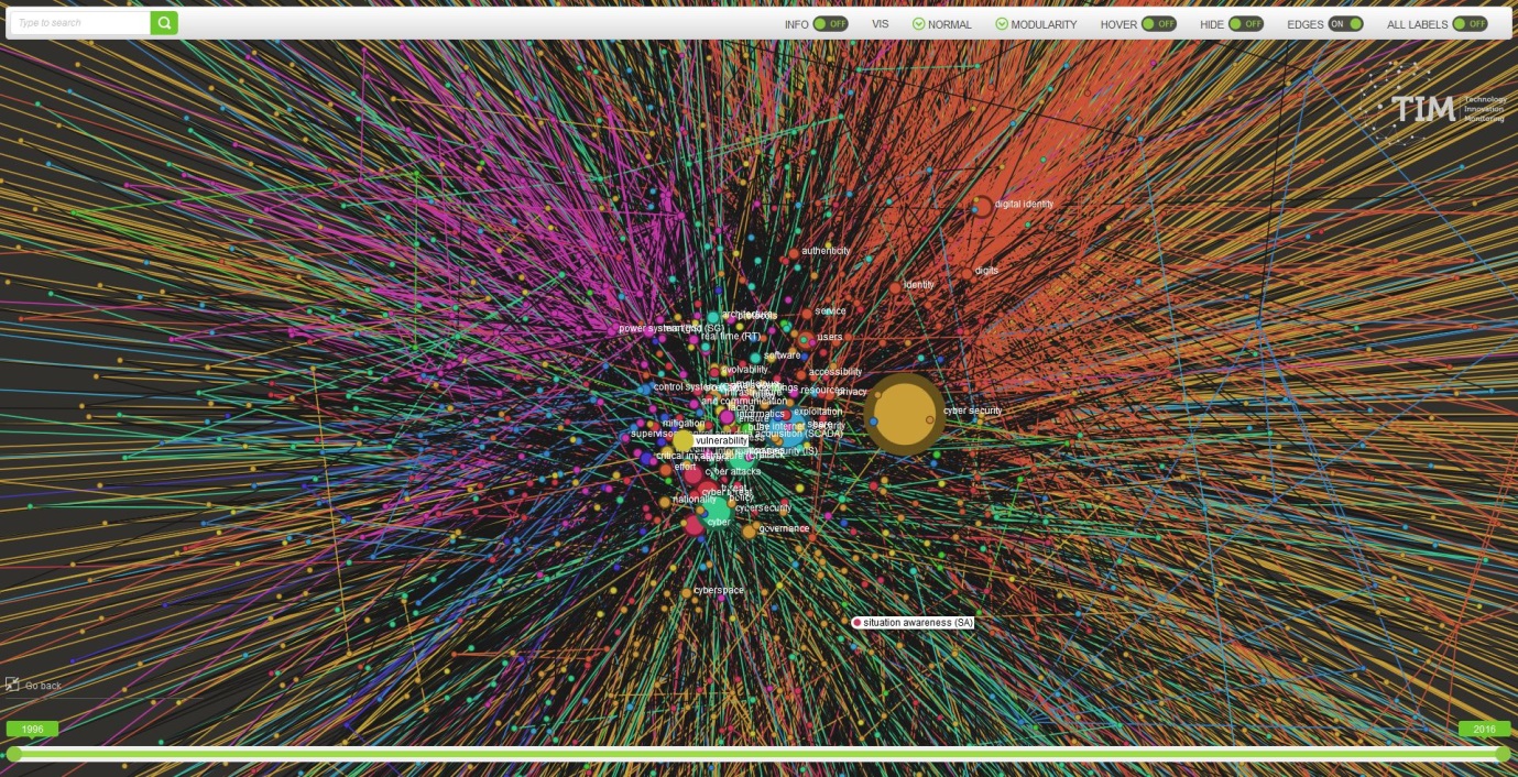
In a keyword graph each node represents a keyword (for example: Cyber Security or Transplantation).
The link between two keywords represents that at least one document has at least those two keywords.
The thicker the node, the higher the number of documents that have those two keywords is.
7.2.5. Semantic Scholar Keywords
In this visualisation, the keywords that are shown are the keywords attributed by Semantic Scholar to their publications. This is done automatically through AI algorithms. All other types of documents are excluded from this visualisation.
7.2.6. Automatic Keywords
In this visualisation, the keywords are computed by TIM for each type of document. Autokeywords or Automatic keywords are computed by text mining techniques. This visualisation includes all types of documents in the system, including those that do not have author keywords.
Read more about the processing of keywords here.
7.2.7. Relevant Keywords
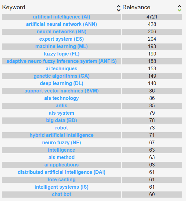
Relevant keywords is an ordered list of terms with an associated score. The score measures the “relevance” of the keyword in the dataset.
Read more about the processing of keywords here.
This document describes the pages that are available to basic users. More options might be available for advanced users.
Attention
If you don’t see the page you are looking for, go to Settings>Page Configuration>Choose a category and make sure the box is ticked for the page of interest.
7.3. Location category
The location tab in TIM gives access to all the graphs relating to the location of the organisations.
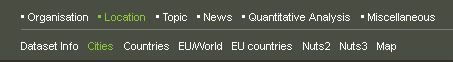
The location is subdivided in different levels, from cities to countries.
The correct attribution of the location of an organisation depends in the first place in a correct identification of the organisation and therefore depends on the process of cleaning and harmonization of the organisations.
In this type of graphs, each node represents a location (city, region, country…)
The links between locations represent collaboration between two organisations in the different locations. They correspond to documents where the two locations appear. Therefore the links represent co-publishing, co-patenting or co-granting of EU projects between different geographical locations. The thicker the node, the more intense the collaboration (in terms of common number of documents) is. For groups of locations of the same colour, the graph suggests that those tend to collaborate more among themselves than with the others (read more about communities of nodes)
The countrygrams show the countries where organisations are located.
This visualisation is based on the country of the organisations that have been processed by the Entity Matcher.
7.3.1. EU/World
The worldgrams are countrygrams where all the EU countries are gathered in one node.
This visualisation is based on the country of the organisations that have been processed by the Entity Matcher.
7.3.2. EU countries
The Europegram is a normal countrygram that shows only EU countries. The rest of the countries are not shown.
This visualisation is based on the country of the organisations that have been processed by the Entity Matcher.
7.3.2.1. Regions
The NUTSgrams represent the regions of Europe of the organisations that are publishing, patenting or receiving EU projects. The NUTS classification (Nomenclature of territorial units for statistics) is a hierarchical system for dividing up the economic territory of the EU.
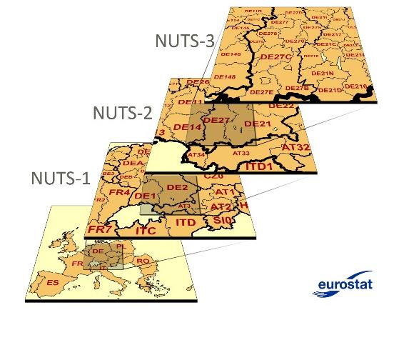 NUTS3 is a more granular level of regions than NUTS2.
7.3.3. Nuts2
In a NUTS2grams nodes are NUTS2 level regions.
This visualisation is based on the NUTS2 region of the organisations that have been processed by the Entity Matcher.
7.3.4. Nuts3
In a NUTS3grams nodes are NUTS3 level regions.
This visualisation is based on the NUTS3 region of the organisations that have been processed by the Entity Matcher.
7.3.4.1. Cities
Citygrams show the cities where organisations are located.
This visualisation is based on the city of the organisations that have been processed by the Entity Matcher.
7.3.4.2. Map
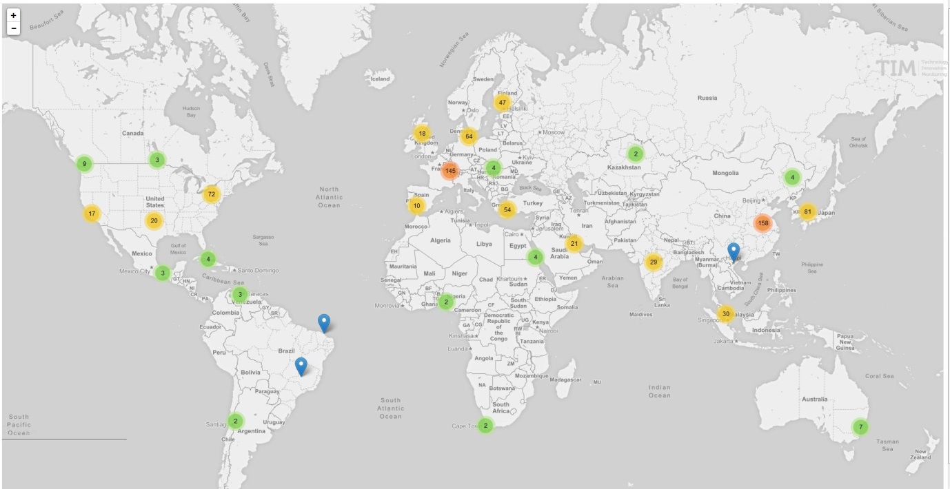
This visualisation is the projection on a geographical map of the city of the organisations that have been processed by the Entity Matcher.
When zoomed out, the colours of the bubbles indicate the intensity of the number of documents per regions. When hovering on the bubble, the region taken into account for the calculation is shown. The map can be zoomed in and out. No filtering or further analysis is however possible.
This document describes the pages that are available to basic users. More options might be available for advanced users.
If you don’t see the page you are looking for, go to settings>page configuration>chose a category and make sure the box is ticked for the page of interest.
7.4. Miscellaneous category

This page contains graphs with a few additional fields that are present in the data.
Note
Keep in mind that some of the default visualisations, such as “Year” or “Data source” are meant to be used mostly for filtering purposes and not for exploratory analysis.
7.4.1. Documents
This page displays a list of the documents in the dataset and some basic information about them. Because this page is fundamental, it is made available to all other categories.
Access to the abstract or description is also provided, throught the plus button on the right of each document box. If available, for all types of sources, a link to the original location of the document is provided. When the title of the document is in bold, it indicates that there is a link to the source.
For scientific publications, access to the full article might be possible. In any case the landing page of the article at the publisher is displayed from where the document can then be dowloaded or otherwise purchased.
For patents, a link to the patent in Espacenet is provided.
For EU projects, the link to the description of the project in Cordis is provided.
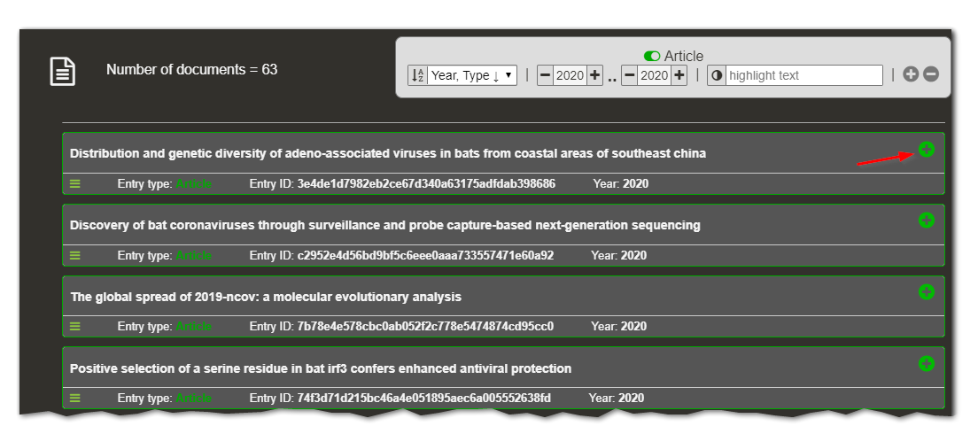
To ease computation time, only 1000 documents are shown in the list. If a filter has been applied to the data, only the documents that correspond to that filter are shown. Moreover, additional filtering can be applied by using the top right box.
7.4.2. Year

This graph represents the years of the documents. The date taken into account is:
the year of publication for scientific publications,
the year of the priority date for patents,
the year of beginning of the project for EU projects.
The size of the nodes represents the number of documents for each year. There are no edges between the nodes because one document can only have a single publication year.
The visualisation might not convey a lot of useful information, but it can be used to filter for specific years (by double-clicking on the specific node).
7.4.3. Type of document
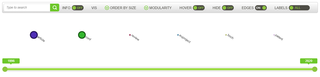
This network graph represents the types of documents, which are listed in the table below.
value |
type |
|---|---|
article |
Research article |
patent |
Patent |
euproject |
EU project |
The size of the nodes represents the number of documents for each type. There are no edges between the nodes because one document cannot be of two different types.
The visualisation might not convey a lot of useful information, but it can be used to filter for specific types (by double-clicking on the specific node, and then moving on to another visualisation).
7.4.4. Data Source
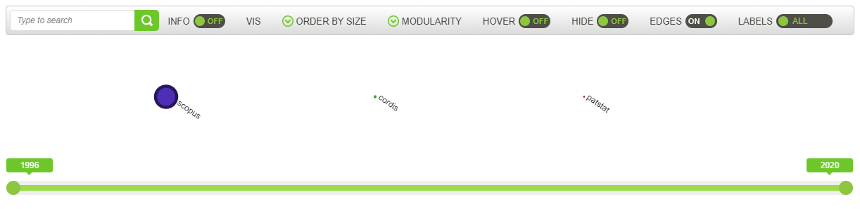
This network graph represents the source of each document, meaning the original database where the documents are coming from.
For example, the basic sources used in TIM are SScholar for scientific publications, Patstat for patents and Cordis for EU projects, if you are looking at this specific group of documents.
The size of the nodes represents the number of documents for each source. There are no edges between the nodes because one document cannot be originated from two different sources.
The visualisation might not convey a lot of useful information, but it can be used to filter for specific sources (by double-clicking on the specific node).
This document describes the pages that are available to basic users. More options might be available for advanced users.
7.5. Quantitative Analysis category
There are two pages available by default in this category: Dataset Info (which is actually available from any tab) and Time Series.
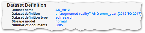
7.5.1. Dataset Info

This page displays facts about the dataset, in terms of number of documents and filtering, if any.
The top part of the page shows the dataset definition and creation metadata, along with the number of documents.
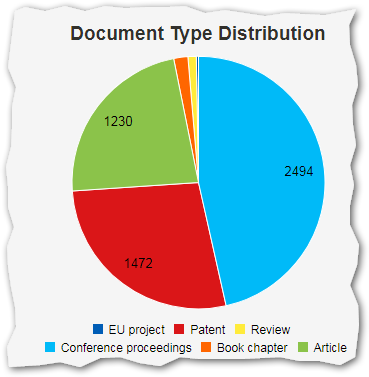
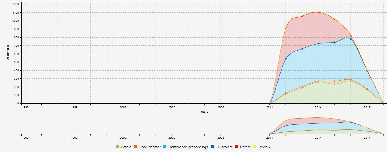
The pie chart displays the total number of documents by document type.
The line/area/bar chart displays the number of documents by type and by year.
This page adapts its content, depending on a pre-defined setup. Some of these setups can be temporarily modified, though.
7.5.1.1. Data definition grow/shrink
The data definition string can sometimes become very long. To make the page lighter and more legible, in that case the definition gets truncated, is reduced to one line and ends with an ellipsis (…). Clicking on the data definition toggles the truncation back and forth.
7.5.1.2. Mouse over pie slices
To display pie slice details, simply move the mouse cursor over a pie slice. The current pie slice stays the same, but the other slices become transparent. In addition, a small hint box appears showing the slice details.
7.5.1.3. Click on the chart legend label
In case you need to, you can remove a document type (i.e. a pie slice) from the pie. To do this, simply click on the document type you want to hide in the pie legend. The label fades out, the pie slice disappears and the pie is adapted. Click again on the label to make the data appear back again. This works on the line chart too. This is useful in some cases where a pie slice is too small to be legible.
7.5.1.4. Switch from area chart to line or bar chart
By default, the chart at the right is configured to display an area chart. However, two more charts types are available: lines and bars. To switch to the other chart types, click on any of the other icons at the top-right of the chart.
7.5.1.5. Switch line smoothness on the line chart
A classical line or area chart draws straight lines from one point to the other. This isn’t always pleasant to the eye. The Smooth lines option changes the lines from straight to curves, which is the default. To change that, enable the option in the upper right corner of the chart. Note that this option has no effect on bar charts.
7.5.1.6. Change the line chart series order
You can change the order of the series by selecting your preference in the sort multiple choice list, at top of the chart.
7.5.1.7. Stack values in the line chart
Depending on your needs, you can switch the chart to display the values stacked or not. When stacked, the top of the line (or bar) displays the total for that x-axis value, but it might be more difficult to identify some series heights. Click on the Stacked values switch to turn the stacking on or off.
7.5.1.8. Use cumulative values in the line chart
The Cumulative values transforms the data so that each value is the sum of all preceding ones in the same series.
Click on the Cumulated values switch to turn cumulative values on or off.
7.5.1.9. Area chart zoom and pan
At the bottom part of screen, a chart reduction (smaller height) enable to zoom and pan the chart.
When moving the mouse cursor over the bottom part, the cursor turns into a + sign.
Click and drag in that part to zoom.
You can change the zoom width by dragging the edges of the selected part, which is a bit darker.
To move the selected part, move the mouse cursor inside the selected part, and drag it to left or right to match yoour need.
7.5.2. Time Series
This page serves as an example of what types of visualisations can be achieved by customising the Time Series page. By default, the page shows a Time Series for the Organisations field.
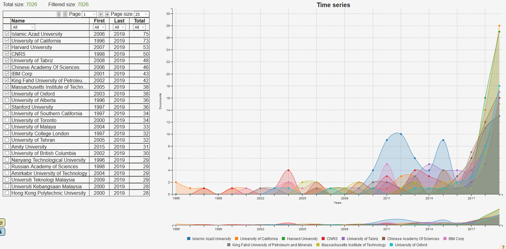
The screen is divided into two regions: on the left, a table displays the data contained in the dataset, on the right, a chart renders the selected data.
The chart plots the number of documents that correspond to each organisation as a function of time. By default, only the 10 biggest organisations are displayed in the graph. The selection can be changed by ticking or unticking the box in the left table.
This page has a pre-defined setup. However, some of the settings can be temporarily modified. On reloading the page, the modifications will be lost.
7.5.2.1. The Data Table
The widgets on the top 3 rows of the table manipulate the table.
The first row controls the pagination of the entries.
By default, only 25 entries are displayed at a time, but this can be changed by selecting a different value in the Page size selection box.
The options are 25, 50, 100 or All.
Note that selecting to display ‘All’ entries might significantly slow the system down.
If the number of entries exceeds the screen height, a scroll box appears.
To view the next or previous pages, use the respective arrow button.
To go to the first or last page, click on the respective chevrons, <<, >>.
It is also possible to access a specific page by selecting its number in the page number dropdown menu.
What is shown on the table is not what is shown in the chart.
By default, the first 10 entries in the table are selected to be shown in the chart. The first column in the data table consists of selection checkboxes. When the checkbox is ticked, the data series in the same line as the checkbox is added to the chart. To remove a data series from the chart, simply untick its checkbox.
The third row provides filtering options for the list.
To activate the name filter, select the match option from the dropdown under Name, press the tab key and start typing a string, e.g. “university”.
Then you can proceed to check the rows that you want displayed in the chart.
unmatch provides the opposite function, e.g. university entries can be hidden away.
The filters on the other columns work in a similar fashion.
Selecting the “less than” operator in the First column, < and then a value from the dropdown menu, e.g. 2004, will only display organisations whose earliest document is after 2004.
When filtering data, the row above the table shows the number of entries selected by the active filters (if any), next to the the total number of entries.
7.5.2.2. The chart
By hovering the mouse pointer over a data point, a floating box appears showing the value for each of the data series for that specific time point. Below the chart, a miniature version of the time series is available to filter for different time windows. By click-dragging the mouse over the mini graph, a selection rectangle allows the user to zoom in the time frame of interest on the main chart, as shown below.
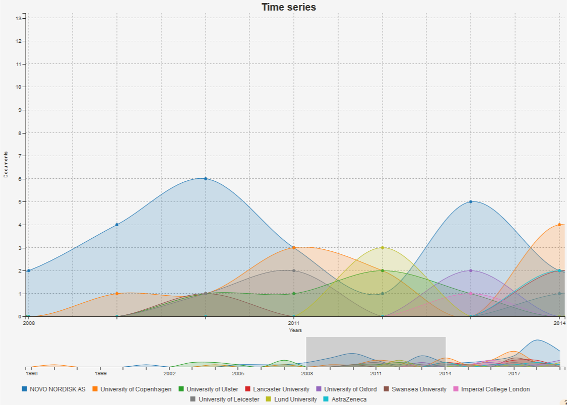
It is possible to remove a data series (i.e. an organisation) from the chart. To do this, simply click on the legend of the series you want to hide in the chart. The label fades out, the series disappears and the chart is adapted. Click again on the label to make the data appear back again.
More options for the chart are available when clicking on the settings tab (yellow tab on the lower left corner of the visualisation). Some of these options include changing the chart type, as well as displaying the data stacked or not. When stacked, the data series appear in bottom-to-top order, according to the selection order: the first selected data series appears at the bottom of the chart. The other data series are piled up in the selection order.
7.6. Data category
The “Data” page category is only available to users with role advanced.
This category contains pages that show the actual data of the documents of the dataset in textual formats like JSON, RSS, other key-value representations. There is also information about document distribution among the sources available in TIM and a status page of the various Transformations in place.
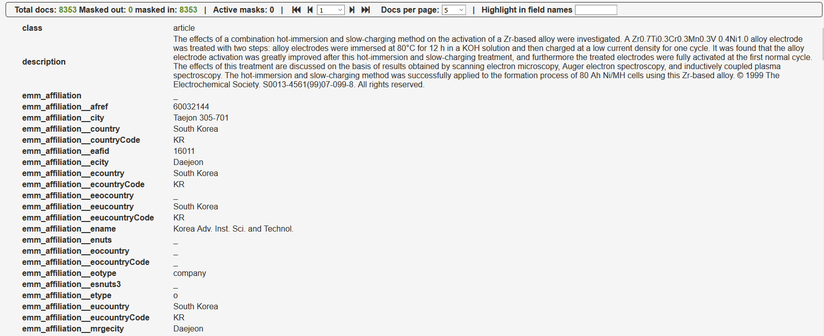
7.6.1. Main Fields
The Main Fields page displays the values for the two main fields of the document in the dataset, the title and the description.
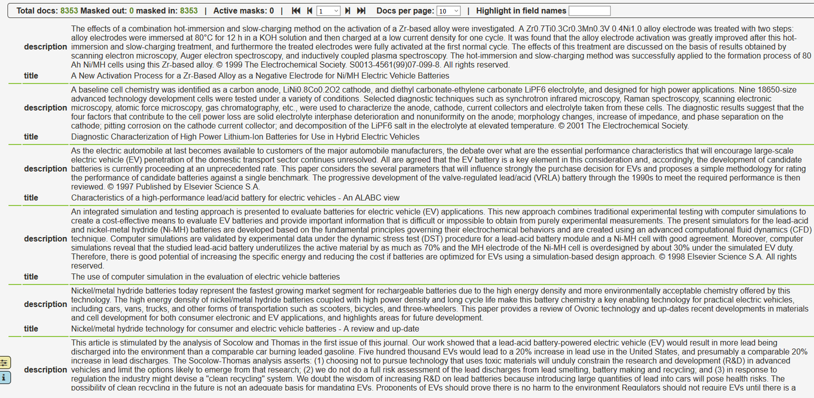
Somme commands on the top of the page allow to modify the appearance of the page, by displaying more or less documents per page, making a search, etc…
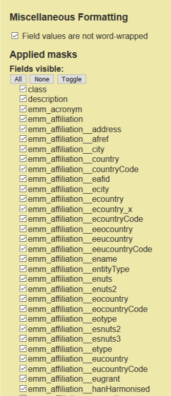
7.6.2. Field Viewer
This page is very similar to the Main Fields page, however it displays all of the fields and values for the documents in the dataset. This allows the user to quickly see which fields are available and what values are assigned to them, which is useful in many scenarios.
One possible scenario is troubleshooting “dirty” data, tracking their origin and perhaps selecting an alternative field for creating visualisations.
Some commands on the top of the page allow the user to modify the appearance of the page, by displaying more or less documents per page, making a search, and so on.
The yellow settings tab on the bottom left of the screen can be used to hide/show the available fields.
7.6.3. Transformation Status
This page is only relevant if there are data transformations applied on the Space, in which case it shows the status of the transformations, along with some statistics, if applicable. For more information on the use of transformations see Transformations.
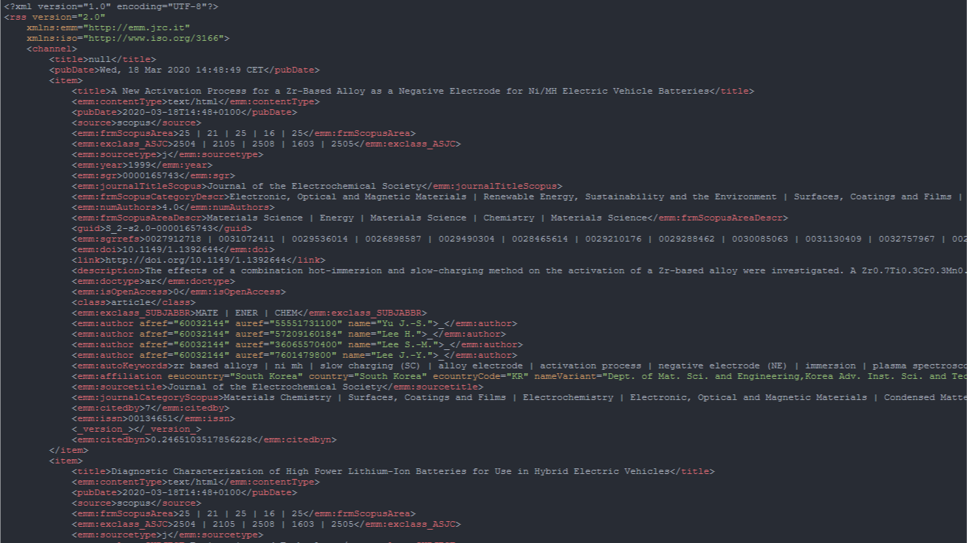
7.6.4. RSS
This page displays the dataset in RSS format.
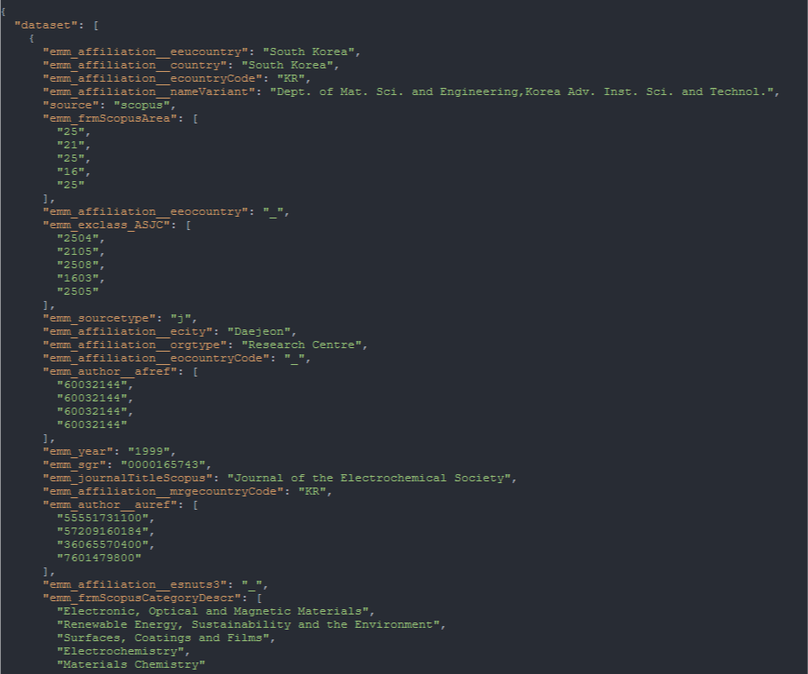
7.6.5. Json
This page displays the dataset in JSON format.